
Remarkably Bright Creatures Cover Design: 5 Packaging Lessons for Debut Authors
Part 4 of Beyond the Octopus: A Remarkably Bright Creatures Masterclass
Most readers will never consciously notice your book cover.

That's not an insult. It's how covers work. The decision to pick up a book — or click on it, or screenshot it, or press it into a friend's hands — happens in seconds and below the level of conscious thought.
Something signals "this is for me" before the brain has time to articulate why.
The Remarkably Bright Creatures cover, designed by Vivian Rowe for Ecco/HarperCollins, is a masterclass in making that signal land exactly right.
Every choice is precise.
Every choice is doing work.
Understanding what that work is will change how you think about your own.
→ Catch up on the whole story in Why Remarkably Bright Creatures Became a Bestselling Debut Novel (It Wasn't the Octopus).
What You See First
Before we break this down element by element, a quick description:
The RBC cover (USA version) is illustrated, not photographic.
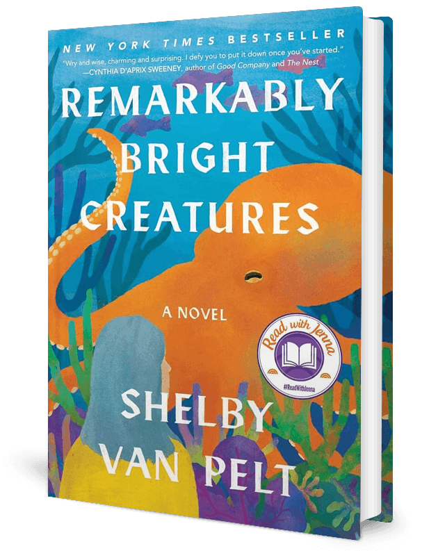
A giant Pacific octopus dominates the composition, rendered in warm teal and amber tones against a deep teal background.
The octopus is large — almost uncomfortably so — filling most of the cover with its body and extending tentacles toward the edges.
The title "Remarkably Bright Creatures" sits across the top in clean, modern sans-serif type. The author name "Shelby Van Pelt" anchors the bottom.
The overall palette is rich, deep, and saturated. It feels expensive.
And it feels specific. Not "ocean book." Not "marine biology textbook." Something entirely its own.
That specificity is the whole lesson.
Lesson 1: Illustration Signals Literary Ambition
The first and most important design decision on this cover isn't color or composition. It's the choice to illustrate rather than photograph.
Most commercial fiction covers use photography — a person, a landscape, a dramatic image manipulated in post-production.

Illustrated covers signal something different.
They say: this book has a distinct artistic vision. This isn't a commodity product. This is a world someone drew from scratch.
Illustrated covers tend to skew toward literary fiction, picture books, and books that want to be taken seriously as art objects — not just as entertainment.
For a debut novel with a premise that could easily read as gimmicky (octopus narrator!), the illustrated cover is doing critical work.
It's telling the reader: this is not a novelty. This is a serious, carefully crafted book.
The octopus is the vehicle. The artistry is the point.
When you're making cover decisions, illustration versus photography isn't just an aesthetic choice. It's a positioning statement about where your book lives in the literary landscape.
Lesson 2: The Palette Does Emotional Work Before the Story Can
Color is not decoration. It's the first emotional signal your cover sends, and it arrives before a reader processes a single word of your title.
The RBC cover uses a deep, saturated teal as its dominant color, warmed with amber and orange in the octopus's skin tones and the rippling water around it.
Teal is an interesting choice.

It's not the obvious ocean blue most marine-themed books would reach for. It's warmer, richer, and slightly more complex — a color that sits between green and blue without fully committing to either.
That ambiguity is doing emotional work. It says: this book will hold things in tension. It won't resolve neatly into one feeling.
The amber warmth prevents the cover from reading as cold or clinical, even though it depicts a creature that could easily come across as alien or unsettling.
The warmth says: there is love in this book. There is hope in this book. Welcome in.
For your own cover, ask what emotional temperature your book runs at, and make sure the palette reflects that honestly.
Readers who pick up a warm-palette book expecting a warm-palette experience and get a cold, spare literary novel will feel misled. And alignment between cover emotion and book emotion builds trust with readers over time.
Lesson 3: The Octopus Is Earning His Place
Here's where this cover gets interesting from a design strategy perspective.
The octopus is enormous.
He takes up most of the cover. And in less skilled hands, this would be a problem — a gimmick leading with its own gimmick.
But Rowe renders Marcellus with enough detail and dignity that he reads as character, not mascot.
The way the tentacles extend and curl, the specificity of the suckers, the slight sense of intelligence in the composition — all of it says: this animal is a thinking, feeling presence. He’s a character. Not a quirky accessory.
The cover makes the same argument as the book: the octopus is a person. Take him seriously.
There's also a compositional decision worth noticing. Marcellus isn't looking at you. He's angled away, slightly mysterious, not performing for the reader's gaze.
That reserve is a character choice, not just an aesthetic one. It suggests interiority. It suggests there's more to him than what's on the surface.
When your cover features a character — human or otherwise — consider where their gaze lands.
A character looking directly at the reader creates intimacy and confrontation.
A character looking away creates mystery and depth.
Neither is wrong. Both are deliberate choices that shape how a reader enters the book.
Lesson 4: Typography That Steps Back (And Why That's Smart)
The title treatment on this cover is notably restrained.
"Remarkably Bright Creatures" sits at the top in a clean, modern sans-serif. It's legible, appropriately sized, and does its job without competing with the illustration below it. The author name at the bottom follows the same logic. Neither element is trying to be the most interesting thing on the cover.
That restraint is a confidence move.
When your illustration is doing this much work, typography that fights for attention would undermine everything.

The font choice also signals something. A decorative, swirling script would push the cover toward whimsy and romance territory. A bold, aggressive display face would push it toward thriller.
But the clean sans-serif keeps the book in literary fiction while maintaining accessibility. It doesn't alienate readers who might be nervous about the octopus premise. It says: we are sophisticated but not forbidding.
For debut authors working with designers, resist the temptation to make the typography do too much.
If your cover image is strong, the title's job is simply to be read.
That's enough.
Lesson 5: The Thumbnail Test
Many readers first encounter this cover at thumbnail size — a small image in a grid of search results, a social media post, a BookTok video.
The question every cover needs to answer is whether it survives that shrinkage.

This one does, for two reasons.
First, the deep teal background is distinctive in a sea of covers that default to white or pale blue. Even tiny, RBC stands out.
Second, the octopus silhouette reads at any size. You don't need to see the detail of the tentacles to understand what you're looking at. The shape alone communicates.
A cover that only works at full size is a cover that's doing half the job.
When evaluating any cover — yours included — reduce the image to about one inch tall and see what survives. What's still legible? What shape reads clearly? What color stands out against the other covers around it?
Those are the elements actually carrying your marketing weight.
The Bigger Lesson for Debut Authors
If you're a debut author publishing traditionally, you may have limited say in your cover.
Publishers retain final approval, and first-time authors don't always get to negotiate design direction. That's a hard truth worth knowing before you get there.
But limited say isn't no say. And understanding what makes a cover work — what the design choices communicate, what signals they send, what readers they attract and repel — means you can advocate intelligently in conversations with your publishing team.

If you're self-publishing, you have full control, which is both the gift and the responsibility.
A weak cover will work against everything else you do well.
A strong cover will do marketing work you can't do any other way.
Either way, your cover is a business decision, not just an aesthetic one. Treat it like one.
The RBC cover didn't go viral because of the octopus. It went viral because someone made careful, specific, intentional decisions about illustration style, palette, composition, and typography — and those decisions created a cover that was distinctive, emotionally honest, and impossible to scroll past.
That's what we're all aiming for.
→ Next up, we dig into the emotional heart of the book in Why Grief Is the True Engine of Remarkably Bright Creatures.
Not sure what your author brand is actually saying about you?
Your cover, your website, your online presence — they're all sending signals before a reader finds a single word you've written. Start with understanding what those signals should be.

If You Liked This Article, You’ll Also Love…
The Pseudonym Revolution: How Women Writers Disguised as Men Changed Literature Forever
From Debut to National Bestseller: Analyzing Eowyn Ivey's Career Trajectory
Near vs Far Enemies in Author Life: Why 'Positive' Emotions Might Be Sabotaging Your Success
Is Wild Dark Shore a Thriller? How McConaghy Bends Genre Expectations
