Typography Trends for Author Websites in 2026

Part 3 of Author Website Typography Unlocked
Most "typography trends for 2026" articles are written for e-commerce stores, tech startups, or generic businesses.
They'll tell you to use kinetic typography or experimental layouts that might work for a sneaker brand but will absolutely tank an author's credibility.
Here's the thing: your website isn't selling widgets.

It's selling trust in your storytelling ability.
The typography trends below aren't just trendy for trend's sake. I'm seeing these shifts across successful author websites in 2026 because they genuinely improve readability, credibility, and user experience.
—> New to the Typography Unlocked series? Unsure if typography matters? Hop over to Part 1, “What is Typography and Why Is It Important For Author Websites?”
Trend #1: Bigger Body Text (18px Minimum)
Let's start with the most impactful change you can make to your website today.
16px body text is officially old news. 18-20px is becoming the new standard.
Why? Because 60% of your readers are on mobile devices, and a significant portion of those readers are over 35.
Romance readers, literary fiction readers, thriller readers—these demographics skew older, and their eyes are aging.

Your beautiful prose is completely wasted if readers have to pinch and zoom to read it.
I know what you're thinking: "But won't bigger text look clunky?"
No. Here's what actually looks clunky: cramped, hard-to-read text that makes visitors bounce from your site in under 10 seconds.
Modern screens—both desktop and mobile—have high enough resolution that 18-19px text looks clean and professional, not cartoonishly large.
We're not talking about making your site look like it's designed for toddlers. We're talking about making it readable for actual humans who might be reading your site on the train, in bed, or while multitasking.
The specific consideration for authors:
If you have blog content, book excerpts, or any long-form text on your website, this matters even more.
Reading a 1,000-word blog post in 16px text is exhausting. Reading it in 19px text with proper line spacing? Enjoyable.
What to avoid:
Don't go crazy and jump to 24px unless you're specifically targeting an accessibility-focused audience.
And make sure your line length doesn't get out of control on desktop—you'll need to adjust your content width accordingly.
Trend #2: Serif Fonts Are Back for Body Text
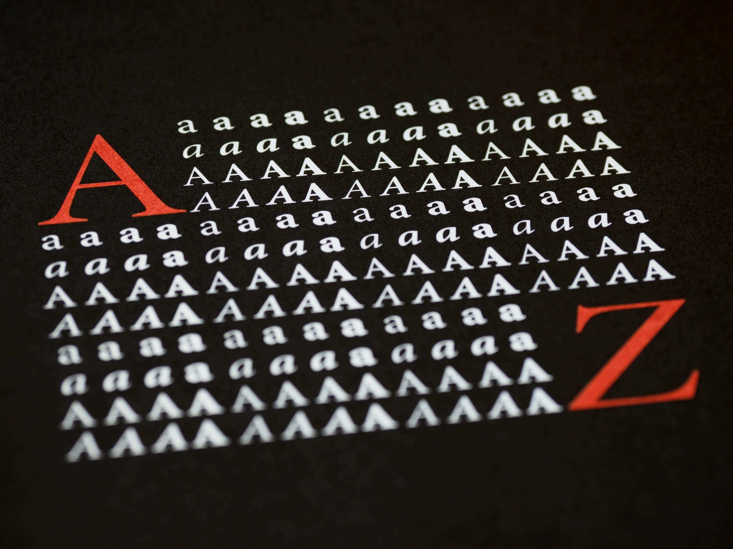
After years of sans-serif fonts dominating the web, serifs are making a major comeback for body text in 2026.
This is huge for authors.
Why? Because high-resolution screens (Retina displays, 4K monitors, modern smartphones) have finally caught up.
Serif fonts, which used to look pixelated and hard to read on screens, now render beautifully online.
And serifs carry built-in literary credibility.
Think about it. Every published book you've ever read uses a serif font for body text.
When readers see serif typography on your website, it subconsciously signals: "This person is a serious writer."
Sans-serif fonts like Helvetica or Arial? They say "corporate presentation" or "tech startup."
That might be fine if you're selling software, but you're selling stories.
The important nuance here:
Not just any serif. Georgia is overused. Times New Roman screams, "I didn't try."
Think: Freight Text, Crimson Text, Lora, Spectral, or Merriweather.
These fonts were built for the web. They have the literary sophistication of traditional serifs with the clean readability needed for screens.
Genre considerations matter here.

Fantasy and historical fiction authors benefit enormously from serifs—they reinforce the gravitas of your genre.
Literary fiction? Absolutely.
Romance can go either way depending on your specific brand (contemporary romance might stay sans-serif; historical romance should consider serifs).
Thriller and mystery authors should test both and see what feels right for their brand.
What to avoid:
Be wary of overly decorative serifs like Playfair Display or Abril Fatface for body text. Those are gorgeous for headlines but exhausting to read in paragraphs.
Save the dramatic fonts for headings.
Trend #3: Dramatic Heading/Body Contrast
This is where you get to have fun.
The trend: pairing an expressive, personality-driven font for headings with a clean, readable font for body text.
This is how you inject your brand personality into your website without sacrificing readability. Your headings can be whimsical, gothic, elegant, or bold—whatever matches your author brand—while your paragraphs remain effortless to read.
Examples of this contrast in action:
Playfair Display (elegant, sophisticated) + Lato (clean, modern)
Abril Fatface (dramatic, bold) + Lora (readable serif)
Cinzel (regal, fantasy) + Montserrat (neutral sans-serif)
The principle is simple: one font does the work, one font supports the work.

Your heading font is the workhorse. It conveys personality, sets the tone, creates visual interest.
Your body font is the support system. It disappears into the background, letting your actual words shine.
This is especially important for authors because your words ARE your product.
You don't want readers distracted by your typography—you want them absorbed in your content.
Genre-specific pairings:
Fantasy authors can lean into dramatic serifs for headings (Cinzel, Cormorant Garamond) paired with approachable body fonts.
Literary fiction might use elegant, understated heading fonts (Crimson Text, EB Garamond) with similarly refined body text.
Contemporary romance can experiment with script or hand-lettered heading fonts paired with friendly sans-serifs.
What to avoid:
Pairing two "personality" fonts that compete with each other.
If your heading font is ornate and decorative, your body font needs to be neutral.
If both fonts are trying to grab attention, your website will feel chaotic and unprofessional.
Also avoid pairing two fonts from the same family unless they're specifically designed as pairs. Mixing Montserrat headings with Montserrat body text isn't contrast—it's just boring.
Trend #4: Generous Line Height (1.6-1.8 Becoming Standard)
Cramped text is out. Breathing room is in.
Line height (also called line spacing or leading) is the vertical space between lines of text. For years, the web standard hovered around 1.4-1.5.
In 2026, we're seeing 1.6-1.8 becoming the new normal, especially for long-form content.
Why this matters for authors:
You're asking people to read your blog posts, your book excerpts, your about page. That's not quick scanning—that's actual reading.

And reading requires comfortable spacing.
When lines of text are too close together, readers' eyes have to work harder to track from the end of one line to the beginning of the next. This creates fatigue.
On mobile, where lines are shorter, cramped spacing becomes even more problematic.
The sweet spot for author websites is 1.6-1.7 for body text.
This gives your words room to breathe without feeling disconnected or awkward.
Look at any professionally published book and you'll see generous line spacing. We're simply bringing that same readability principle to the web.
What to avoid:
Going too far.
Line height above 1.9 starts to feel disjointed, like each line is floating separately rather than forming cohesive paragraphs. You want breathing room, not a breathing chasm.
Also consider your line length. If you have very short lines (like in a narrow sidebar), you might be fine with 1.5. If you have longer line lengths, you need more spacing—potentially 1.7 or 1.8.
Trend #5: Asymmetric Typography Layouts
This is the advanced move. And it's not for everyone.

The trend: moving away from everything-centered towards more dynamic, magazine-style layouts with varied text alignment, pull quotes that break the grid, and intentional asymmetry.
Why this is emerging:
Authors are realizing their websites don't have to look like everyone else's.
A well-executed asymmetric layout creates visual interest without adding more content.
Your about page doesn't need another paragraph—it needs better visual hierarchy.
Think: left-aligned headings with varied text widths, pull quotes that span only part of the page, text blocks that sit at different vertical rhythms.
When to use this approach:
Your homepage and about page are perfect candidates for experimental layouts. These are pages where you're making a first impression and establishing your brand.
A thoughtfully asymmetric design signals sophistication and intentionality.
When NOT to use it:
Blog posts. Your blog needs consistency and predictability. Readers should focus on your content, not puzzling out your layout.
Keep your experimental typography on high-impact pages and maintain traditional, readable layouts for long-form content.

What to avoid:
Getting so experimental that readability suffers.
Asymmetry should create visual interest, not confusion. If visitors can't immediately understand where to look next, you've gone too far.
Also consider your technical skills. True asymmetric layouts often require custom code or advanced design skills. Don't fight your platform—work within its strengths.
The Throughline: Making Your Words Easier to Read
Notice what all five trends have in common?
They're all about making your words more accessible, more pleasurable, and easier to read.
If a trend makes your website look cool but your content harder to read, skip it.
Your job isn't to have the trendiest website. Your job is to make readers want to buy your books.
Typography decisions should be intentional, strategic, and relatively permanent. Make thoughtful choices now that will last for years.
Your brand consistency matters more than being cutting-edge. But if you're redesigning your site or launching a new website in 2026, these five trends are worth serious consideration.
They're not trendy for trend's sake—they represent genuine improvements in how readers experience your content online.
And at the end of the day, that's what typography is really about: making your brilliant words as easy as possible to read.
Ready to build a brand that works across every genre you write?
You've learned how typography creates visual consistency and credibility—now discover the deeper strategy that makes your brand work whether you're writing fantasy today or romance tomorrow. Stop rebuilding your brand every time you write something new and learn how to create a foundation that grows with your entire literary career.