
Wild Dark Shore Cover Design Analysis: Visual Branding for Thriller Authors
Your book cover has approximately three seconds to convince a browser to stop scrolling.
That's it. Three seconds to communicate genre, tone, quality, and whether this book is "for them."

Charlotte McConaghy's Wild Dark Shore cover nails those three seconds.
The design is sophisticated, atmospheric, and immediately communicates "literary thriller with nature elements" without a single word.
This isn't accidental—every design choice serves a strategic purpose.
Today we're dissecting exactly what makes this cover work, how it fits into McConaghy's overall visual brand, and what you can steal for your own book covers and author branding.
If you haven't read my complete review and analysis of Wild Dark Shore, start there to understand the book's success and themes.

The Wild Dark Shore Cover: First Impressions
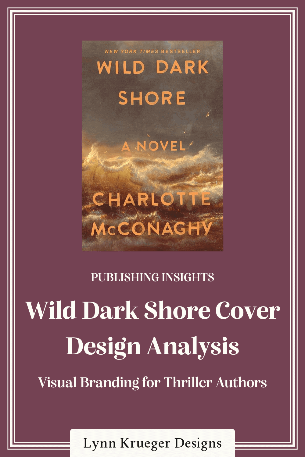
The design features turbulent ocean waves rendered in warm, dramatic tones—golds, oranges, browns, and grays colliding in violent motion.
The typography glows in orange-gold, appearing to emerge from or float above the churning water.
"WILD DARK SHORE" dominates the composition, while "NEW YORK TIMES BESTSELLER" crowns the top.
Everything about this design communicates "intense literary thriller with emotional depth."
The cover doesn't whisper—it roars. But it roars with sophistication, not desperation.
This is controlled drama that signals both commercial appeal and literary credibility.
Design Element #1: The Color Palette
Here's where this cover makes a bold, unexpected choice: warm tones instead of cool.
Most thrillers use blues, grays, blacks—cool colors that suggest mystery and danger. Wild Dark Shore uses oranges, golds, and warm browns with touches of gray.
This warm palette immediately differentiates the book while still communicating thriller territory.
The colors suggest fire, sunrise, or sunset—transformation, endings and beginnings, beauty and destruction coexisting. These are exactly the themes the book explores.
Warm colors also create emotional heat. This isn't a cold, calculated thriller—it's passionate, intense, and emotionally charged. The palette tells you that before you read a word.
The specific shades matter too. These aren't bright, cheerful oranges—they're muted, complex, almost amber. Sophisticated warmth, not cartoonish brightness.
This color choice positions Wild Dark Shore as a literary thriller, not pure genre work.
Design Element #2: The Turbulent Water
The ocean imagery dominates the composition, and its treatment is crucial to the cover's success.
These aren't calm waters or generic waves—they're violent, churning, almost abstract in their intensity. The water looks simultaneously beautiful and terrifying.
The turbulent treatment mirrors the book's emotional landscape and literal setting.
The waves appear almost painterly, like a Turner seascape where nature's power overwhelms realistic representation. This artistic quality elevates the cover beyond typical thriller fare.

The texture and movement create energy. Even as a static image, the water feels alive, dangerous, in motion. This kinetic quality suggests page-turning momentum.
For your own covers: when using natural imagery, consider how texture and treatment communicate tone. Realistic photography says one thing; painterly interpretation says another.
Design Element #3: Typography That Glows
Let's talk about those striking orange-gold letters.
"WILD DARK SHORE" uses a bold, slightly irregular sans-serif font that feels hand-painted or stenciled. It's substantial but not rigid, modern but not cold.
The typography appears to glow against the darker background—it demands attention without screaming.
This glowing effect creates hierarchy naturally. Your eye goes immediately to the title because it's the lightest, warmest element. Then to "NEW YORK TIMES BESTSELLER" and the author name, both in the same warm tone.

The slight irregularity in the lettering—not perfectly uniform—adds to the organic, almost elemental feel. This isn't corporate; it's visceral.
"A NOVEL" appears as a simple subtitle, providing genre clarity without cluttering the design.
The typography feels integrated with the imagery rather than sitting on top of it.
Design Element #4: Composition and Balance
The composition creates movement and tension while maintaining balance.
The title placement—floating in the darker, stormier area—suggests characters surrounded by chaos.
The "NEW YORK TIMES BESTSELLER" banner at the top establishes credibility immediately. For an established author, this positioning is smart—it's the first thing browsers see.
The author name at the bottom anchors the composition. Large enough to signal importance but not competing with the title for dominance.
Everything has room to breathe despite the dramatic imagery. The design feels full without being cluttered.
How This Cover Fits McConaghy's Brand
Now let's zoom out and look at how Wild Dark Shore's cover relates to McConaghy's other books.
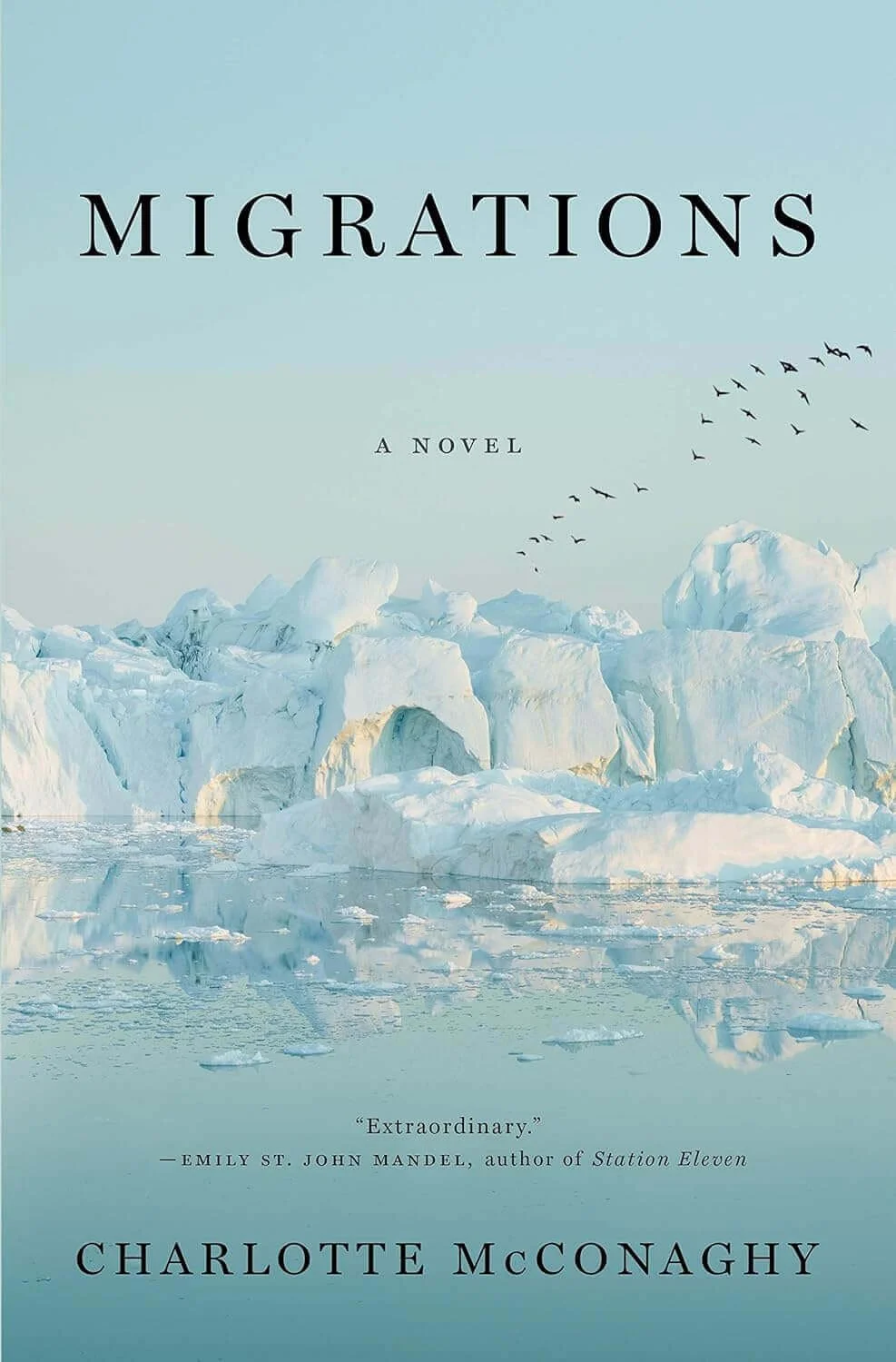
Her previous covers—Migrations and Once There Were Wolves—share certain DNA despite different color stories.
All feature nature imagery prominently. All use dramatic, almost painterly treatments rather than photographic realism. All have clean, strong typography that integrates with the imagery.
But Wild Dark Shore's warm palette distinguishes it from her cooler-toned previous covers.
This signals evolution within consistency. Readers recognize "this is a Charlotte McConaghy book" while understanding "this is something new."
The warm palette also mirrors the emotional heat of this particular story—more intense family drama than the relative isolation of Migrations or the controlled tension of Once There Were Wolves.
This connects directly to what I discussed in my post about building your author brand like Charlotte McConaghy—visual consistency with strategic variation across different projects.

What This Cover Avoids
Sometimes what a cover doesn't include is as important as what it does.
No lighthouse appears on this cover.
Despite the lighthouse being central to the story, the cover trusts that turbulent water alone communicates isolation and drama.

This avoidance of literal representation is sophisticated. The cover evokes feeling rather than depicting specific plot elements.
No people.
Many thriller covers feature faces, silhouettes, or figures. McConaghy's cover trusts that elemental imagery can carry the story.
This absence of people serves the brand. McConaghy writes atmospheric fiction where nature functions as character. Human figures would shift focus away from that elemental quality.
No additional taglines or descriptive text.
Beyond "A NOVEL," the cover doesn't explain itself. For an established bestselling author, this restraint works.
Genre Signals and Reader Expectations
Every cover communicates genre, whether intentionally or not.
Wild Dark Shore's cover signals: literary thriller, upmarket commercial fiction, atmospheric, emotionally intense, nature-focused, serious but accessible.
The warm, dramatic palette sets it apart from standard thriller blue-gray templates.
This differentiation is strategic. The cover catches the eye in a sea of similar designs. It suggests "literary thriller" rather than "airport thriller."
Someone looking for a cozy mystery won't pick this up—and that's good. Someone seeking formulaic suspense might pass—also fine. Someone wanting emotionally rich, atmospheric literary suspense will grab it immediately—perfect.
The "NEW YORK TIMES BESTSELLER" banner provides permission to readers who want quality confirmation.
It signals: this isn't just beautiful—it's proven successful.
The Thumbnail Test

Here's a critical question: does this cover work at thumbnail size?
Most readers first encounter covers as tiny images on websites or apps.
Wild Dark Shore passes this test beautifully. Even small, the dramatic contrast between the glowing orange-gold typography and the darker turbulent background ensures visibility.
The bold title and simple composition prevent muddy confusion at small sizes.
The warm tones also help it stand out in thumbnail grids where most thrillers use cool blues and grays. This cover literally glows among the competition.
When evaluating cover designs, always check thumbnail performance. Reduce the image to about one inch tall and see what remains visible and impactful.
The Emotional Impact
Beyond technical execution, covers need to create emotional response.
Wild Dark Shore's cover evokes specific feelings: intensity, beauty in chaos, transformation, danger, warmth despite darkness, elemental power, emotional turbulence.
These emotions align perfectly with the reading experience the book provides.
The warm palette creates an interesting emotional contradiction—warmth usually signals comfort, but combined with violent waves, it signals passionate intensity. Beauty and danger coexist, just as they do in the story.
This emotional complexity is what makes the cover sophisticated. It doesn't offer simple, single-note mood. It promises layered, complex emotional experience.
A reader drawn to this cover's intensity will likely connect with the book's emotional depth.
Someone seeking escape or lightness will self-select out.
Common Cover Design Mistakes This Avoids

Let's talk about what this cover gets right by avoiding common pitfalls.
Mistake #1: Following the Blue Thriller Template. By using warm tones, Wild Dark Shore differentiates itself in a crowded market.
Mistake #2: Literal Representation. The cover evokes rather than depicts, creating intrigue rather than explanation.
Mistake #3: Typography Fighting Imagery. The text and image are unified through color and integrated composition.
Mistake #4: Lack of Energy. The turbulent water creates kinetic movement that promises page-turning momentum.
Mistake #5: Genre Confusion. Despite its uniqueness, the cover clearly signals literary thriller, not romance or horror or mystery.
Your Cover as Part of Your Brand
Individual book covers matter, but they're also part of your larger author brand.
If you're planning a career (not just one book), think about visual consistency across your covers.
McConaghy's covers share a family resemblance—dramatic nature imagery, sophisticated color palettes, clean typography—while each being distinctive.
This allows readers to spot her work and creates professional cohesion. Wild Dark Shore's warm palette distinguishes it from her cooler previous covers while maintaining the elemental, nature-focused aesthetic.
When working with designers on subsequent books, provide your previous covers as reference. Discuss what elements should remain consistent versus what should evolve.
I discussed this concept extensively in my post about Charlotte McConaghy's author website—visual branding should be cohesive across all your platforms.

Working with Designers: What to Communicate
If you're hiring a cover designer, communicate clearly:
Your genre and subgenre—be specific. "Atmospheric literary thriller with emotional intensity and environmental themes" gives better direction than just "thriller."
Comparable titles—books similar to yours in tone and market.

What emotions or atmosphere you want the cover to evoke.
Focus on feeling: turbulent, warm, intense, elemental, beautiful but dangerous.
Your author brand considerations if you have other books. For McConaghy, maintaining the nature-focused, painterly aesthetic while allowing color variation.
Don't micromanage specific design choices, but do communicate strategic goals clearly.
The Investment Mindset
Cover design is marketing, not just aesthetics.
Wild Dark Shore's cover likely contributed significantly to its bestseller status. The dramatic, sophisticated design signals quality and differentiates in a crowded market.

If you're self-publishing, your cover might be your single most important marketing investment.
A great cover can carry mediocre writing further than a mediocre cover can carry great writing. That's not fair, but it's market reality.
Budget accordingly. Prioritize cover design over most other marketing expenses.
Bringing It All Together
This final post in the Wild Dark Shore series completes our exploration of what makes this book—and Charlotte McConaghy's career—so successful.
From atmospheric writing to strategic branding, from POV choices to climate theme marketing, from remote settings to visual design, every element works together.
Success at McConaghy's level isn't accidental—it's craft, strategy, and cohesive presentation across every aspect of your author career.
Your book cover is one piece of your author brand, which is itself one piece of your overall career strategy. Every element should work together to represent you authentically while connecting with your ideal readers.
Need help creating an author brand and website that works as hard as your writing?
That's exactly what I do. From strategy to execution, I help authors build cohesive brands and professional websites that grow with their careers. Let's talk about your author brand.
