
Charlotte McConaghy's Author Website: What She Gets Right (And What You Can Learn)

Article 5 of the Wild Dark Shore series
Most author websites make the same fatal mistake: they're built around one book instead of a career.
You land on the homepage and see a giant book cover. Scroll down and everything—the colors, the imagery, the entire vibe—screams "This One Book." It's beautiful, sure. But what happens when the next book releases?
Complete redesign. New colors. Different aesthetic. Essentially starting over.
Charlotte McConaghy's website doesn't make this mistake. At charlottemcconaghy.com, you'll find a site that showcases her books without being enslaved to any single one.
It's an example of building a professional author website that can grow with a career.
Let's break down exactly what she gets right—and what you can steal for your own author website.
If you haven't read my full review of Wild Dark Shore yet, start there to understand McConaghy's work and success.

First Impressions: Clean, Literary, Cohesive

When you land on McConaghy's homwebsiteepage, you immediately understand who she is as a writer.
The design is clean and uncluttered. Lots of white space. Elegant typography. Natural, muted colors—soft teals, earth tones, whites.
Nothing about this design screams "LOOK AT ME" or tries too hard.
This restraint is intentional. McConaghy writes literary fiction with atmospheric prose and environmental themes. Her website design mirrors that sensibility.
If her site were busy, colorful, and packed with graphics, it would create cognitive dissonance. The design would contradict the writing.
Your website design should feel like an extension of your work, not a separate entity.
The Homepage: Purpose Over Flash

McConaghy's homepage does exactly what a homepage should do: it orients you quickly, highlights her books, and guides you where to go.
At the top, a simple navigation menu. No confusion, no overwhelming dropdown menus with seventeen options.
Simple navigation is smart navigation.
The homepage answers the visitor's primary question: "Who is this author and what have they written?"
There's no blog cluttering the homepage. No newsletter popup attacking you the second you arrive. No autoplaying video.
Just clean, clear information that lets visitors explore at their own pace.
The Books Page: Showcasing Without Overwhelming
This is where many author websites fall apart. They either showcase every book equally (confusing readers about where to start) or they focus entirely on the newest release (ignoring the backlist).
McConaghy strikes a balance.

Wild Dark Shore—her newest and most successful book—gets prominent placement. But Migrations and Once There Were Wolves are equally accessible.
Each book gets its own section with cover image, description, praise quotes, and buy links.
The descriptions are concise but compelling. They tell you what the book is about without spoiling the experience. They include just enough critical praise to establish credibility without overwhelming you with every review ever written.
The buy links are simple and functional. Amazon, Barnes & Noble, Bookshop, IndieBound. No aggressive "BUY NOW!!!" language, just straightforward options.
This approach respects the reader's intelligence and autonomy.
Color Palette: Versatile Without Being Bland
Here's where McConaghy's site demonstrates sophisticated branding.
The overall color scheme is muted and natural—whites, soft teals, gentle earth tones. These colors feel literary, calm, and nature-focused without being locked to any specific book.
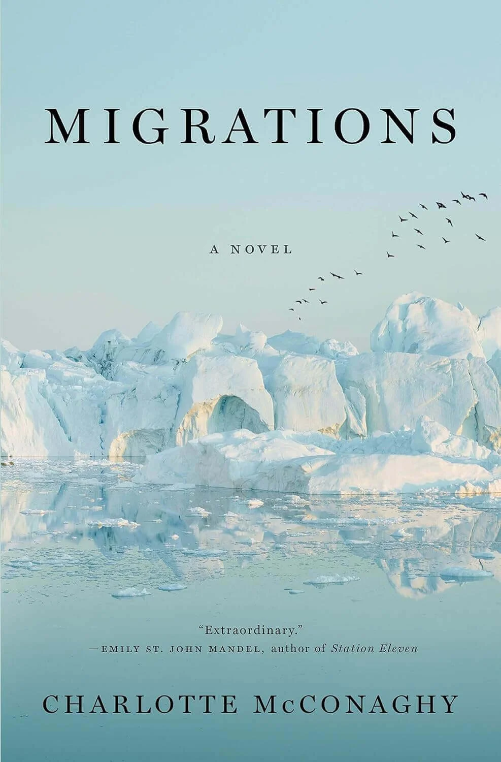
This palette works for Migrations (arctic seas), Once There Were Wolves (Scottish Highlands), and Wild Dark Shore (Antarctic island). It will work for whatever she writes next.
The colors represent HER as a writer, not any individual book.
Compare this to an author who rebuilds their entire site in dark purples for a fantasy novel, then has to switch to bright pinks for a rom-com. That's exhausting and confusing for readers.
McConaghy's palette has flexibility built in. Book-specific imagery and cover art provide pops of color, but the foundation remains consistent.
This is what I mean when I tell clients to build brands that grow with their careers.
I wrote extensively about this concept in my post about building your author brand like Charlotte McConaghy—check it out for the full philosophy.

Typography: Elegant and Readable
The font choices on McConaghy's site communicate immediately: this is literary fiction by a serious writer.
The typography is clean, elegant, and highly readable. Nothing overly stylized or trendy. Nothing that will look dated in two years.
Good typography is invisible—it just feels right.
Headers are clear without being shouty. Body text is comfortable to read. The hierarchy is obvious: you know what's a title, what's a description, what's a quote.
This might seem like a small detail, but typography shapes how readers perceive you. Fancy script fonts scream romance. Bold, angular fonts suggest thriller. Clean, sophisticated fonts say literary.
Your font choices are working for or against you whether you realize it or not.
Author Photo: Professional and On-Brand

The author photo on McConaghy's site is worth studying.
It's professional quality—not a selfie, not a casual snapshot. This signals that she takes her career seriously.
The setting appears natural and outdoorsy, reinforcing her brand as a writer focused on nature and wild places.
Her expression is approachable but thoughtful—not a giant smile, not overly serious.
This is subtle branding in action. The photo reinforces everything else the site communicates about who she is as a writer.
Compare this to author photos that contradict their brand. A dark thriller writer with a bright, sunny photo. A serious literary author with a wacky, goofy shot.
Your author photo is part of your brand, not separate from it.
What's Missing: The Strategic Choices
Interestingly, there are several elements McConaghy's site DOESN'T include—and these absences are smart choices.
No Blog
McConaghy doesn't maintain a blog on her author website. For her career stage and audience, this makes sense.
She's writing literary fiction for readers who discover her through reviews, bookstores, and word-of-mouth—not through regular blog content. A blog wouldn't significantly grow her audience and would require time better spent writing her next novel.
Not every author needs a blog.
I maintain one because it serves my business (web design and branding for authors). But for fiction authors, especially those writing literary fiction, a blog is optional.

No Heavy Social Media Integration
Her site doesn't bombard you with social media feeds, follow buttons, or constant prompts to engage on seventeen platforms.
There are simple links to her social accounts. That's it.
This keeps the focus where it belongs: on her books. Social media can support an author career, but it shouldn't dominate your website.
No Newsletter Popup
You won't get attacked by an aggressive newsletter signup popup the second you land on McConaghy's site.
There is a newsletter signup option—it's just not intrusive. It's there for people who want it without annoying those who don't.
Aggressive popups might get signups, but they also alienate visitors.
For an established author with strong traditional publishing support, the tradeoff might not be worth it. For debut authors building from scratch, a strategically-placed (not aggressive) signup might make more sense.
Know your career stage and choose accordingly.
Technical Basics: Fast, Secure, Functional
Let's talk about the unglamorous technical elements that McConaghy's site gets right.

The site loads quickly. No massive uncompressed images taking forever to appear. No janky animations slowing everything down.
It has an SSL certificate (the little lock in your browser)—essential for security and Google ranking.
The buy links work. The contact form works. Everything functions as expected.
These sound like bare minimums, but you'd be shocked how many author websites fail these basic tests.
Your beautiful design means nothing if the site is slow, insecure, or broken.
What You Can Learn: The Takeaways
Let's make this actionable. Here's what to steal from McConaghy's website strategy.
Build Around Your Career, Not Your Current Book
Design a site that can showcase multiple books without requiring complete overhauls. Choose colors, fonts, and imagery that represent YOU as a writer.
Prioritize Clarity Over Cleverness
Simple navigation beats clever navigation every time. Make it easy for visitors to find what they're looking for.
Invest in Quality Basics
Professional author photo. Clean typography. Fast loading. Mobile responsiveness. These aren't luxuries—they're requirements.

Let Your Books Be the Stars
Your website should showcase your work, not your website designer's skills. The design should enhance your books, not compete with them.
Match Design to Brand
If you write dark thrillers, your site should feel different than if you write uplifting women's fiction. Your design choices communicate genre and tone before visitors read a word.
Keep It Sustainable
Don't commit to elements you can't maintain (like daily blog posts or constant news updates). Build something you can realistically keep current.
Respect Your Visitors
No aggressive popups. No autoplay videos. No overwhelming clutter. Treat visitors like intelligent humans who can make their own decisions.
Common Mistakes McConaghy Avoids
Let's also learn from what her site DOESN'T do.
She doesn't make everything about Wild Dark Shore. Yes, it's her biggest success, but the site treats all her books with respect. Readers discovering her through Migrations don't feel like they landed in the wrong place.
She doesn't use generic stock photos. Every image feels intentional and on-brand.
She doesn't bury important information. Want to know about her books? It's right there. Want to contact her? Simple.
She doesn't try to be everything to everyone. The site has a clear point of view and sticks to it.
She doesn't neglect the technical foundation. Speed, security, mobile functionality—all handled properly.
These avoidances are as important as what she includes.
The ROI of a Professional Author Website

Here's the question I hear constantly: "Is a professional website really worth the investment?"
Absolutely. When agents Google you, when publishers evaluate you, when media wants to feature you, when readers want to learn more—your website is often the first impression.
A professional website signals that you're a professional author.
A DIY site thrown together in an afternoon signals you're still figuring things out. That might be fine for your first draft phase, but once you're pursuing publication seriously, your website becomes part of your professional package.
Building Your Own Professional Author Website
If you're looking at McConaghy's site and thinking "I want something like that," here's what you need to know.
Option 1: DIY with a platform like Squarespace or WordPress
This can work if you have design sense, technical aptitude, and time. The risk is creating something that looks "fine" but doesn't quite hit professional.
And if you’re new to website design, this can take a lot of time. I’m talking months, not weeks—and this is time that you could instead be writing.

Option 2: Hire a web designer who specializes in author websites
This is where you get strategic thinking plus execution. The right designer understands author careers, branding, and how to build sites that grow with you.
I'm obviously biased here since this is literally what I do, but there's a reason I specialize in author websites. The strategy is different from business websites, portfolio sites, or e-commerce.
Authors need sites that showcase creative work, build connection with readers, and support long-term careers.
That requires understanding both the craft of writing and the business of publishing. Not every web designer has that context.
Your Website is Your Career Foundation

Charlotte McConaghy's website works because it's built on a solid strategic foundation.
It represents her as an author—her brand, her books, her career trajectory.
It's professional without being corporate. It's beautiful without being flashy. It's functional without being boring.
Most importantly, it can grow with her career without requiring demolition every time she publishes a new book.
That's what I want for every author I work with. A website that's not just pretty, but strategic. Not just current, but sustainable.
Whether you're working on your debut or your tenth book, your website is your digital home base. It's worth getting it right.
Because your website isn't about this book—it's about your career.
And your career deserves better than a DIY template that screams "I threw this together last weekend."
Ready to Build Your Professional Author Website?
If McConaghy's website resonates with you—if you want something clean, cohesive, and built to grow with your career—I can help.
I specialize in creating author websites and brands that look professional, function perfectly, and showcase your work without being locked to one book. We start with strategy, then build something beautiful and sustainable.
Whether you're launching your debut, rebranding after multiple books, or finally upgrading from that DIY site that's been embarrassing you—there's a solution that fits your career stage and goals.
Want to explore what that could look like? Let's talk.
Next in the series: Learn more about Charlotte McConaghy’s writing in “What Authors Can Learn from Charlotte McConaghy's Atmospheric Writing in Wild Dark Shore.”
