Author Website Design Through the Lens of Robert Louis Stevenson: How to Turn Your Location Into Your Brand
Part 5 of Dark Edinburgh: A Robert Louis Stevenson Masterclass
You've identified that place matters to your brand. You've found your through-line. You've done the internal work.
Now what?
Over this series, we've covered RLS's brand foundations, his craft mastery, place as identity, and multi-genre cohesion.
We've talked about theory, strategy, and big-picture thinking.
This is where it gets practical.
How do you actually translate "Edinburgh Gothic" or "Pacific Northwest introspection" or "Southwest expansiveness" into visual design?
How do you capture the essence of a place without looking like a tourism brochure?
Here's what makes this hard:
Balancing sophistication with accessibility.
Using place without being cliché.
Creating something that feels literary and professional, not literal and touristy.
By the end of this post, you'll have a practical framework for incorporating location into your web design.
We'll be using Robert Louis Stevenson and Edinburgh as our case study throughout.
What we're NOT doing: Literal, touristy interpretations of place.
What we ARE doing: Sophisticated visual translation of place into brand essence.
New to this series? Start with Part 1: Robert Louis Stevenson's Author Brand: 5 Lessons for Modern Writers to understand how RLS's Gothic mastery became the foundation of his enduring brand—then come back here for practical web design implementation. (Coming Soon!)
Designing RLS's Website: A Case Study
Let's have some fun with this.
Imagine I was tasked with designing Robert Louis Stevenson's author website today.
How would I incorporate Edinburgh into his brand without making it look like a tourism campaign?
The WRONG Way:
Picture this disaster:
Stock photos of Edinburgh Castle plastered across every page.
Maybe the hero image, the About page background, scattered throughout the blog. Tourist-attraction aesthetic.
Tartan patterns as backgrounds.
Because he's Scottish, right? Never mind that tartan has nothing to do with his Gothic work and would completely undermine the atmospheric dread we're trying to create.
Thistle graphics scattered everywhere.
Little decorative Scottish symbols in the footer, as borders, maybe even as bullet points.
A color palette pulled from the Scottish flag.
Bright blue and white, cheerful and... completely wrong for someone who wrote about body snatchers and moral corruption.
Why this fails spectacularly:
It's literal. It treats "Scottish" as a checkbox to tick rather than a literary sensibility to evoke.
It's cliché. Every Scottish tourism website looks like this.
It doesn't feel literary or sophisticated. It feels like a heritage gift shop.
Most importantly: It has nothing to do with RLS's actual work.
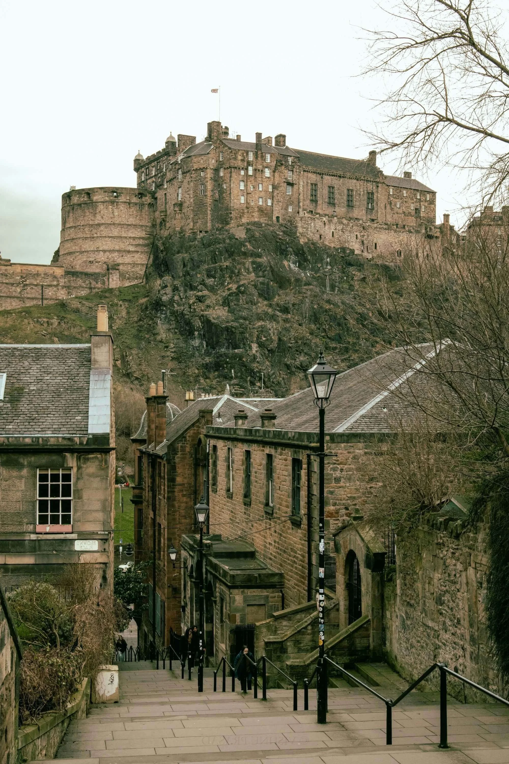
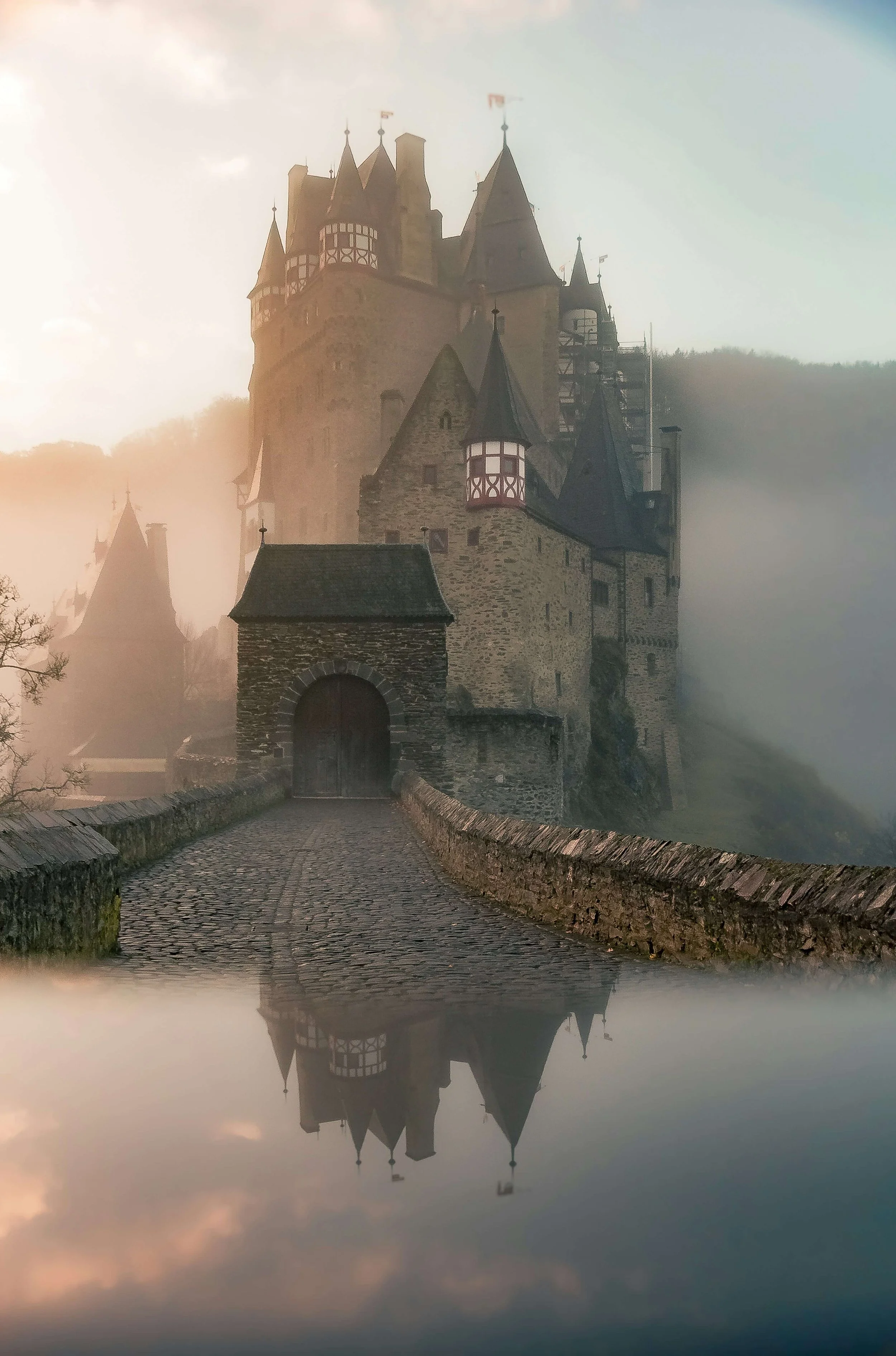
His Edinburgh wasn't castles and kilts.
It was dark wynds, moral compromise, respectable facades hiding horror.
The RIGHT Way:
Now imagine this instead:
Color palette inspired by Edinburgh's Gothic atmosphere:
Deep stone grays (the color of Old Town tenements)
Rich heather purples (Scottish landscape, but darker, moodier)
Night blacks (the darkness that enabled body snatching)
Golden cream accents (lamplight in fog, New Town elegance)

Typography that feels historical yet readable:
Elegant serif for headings (gravitas, literary weight, historical connection)
Clean sans-serif for body text (modern accessibility, professional)
Both with enough weight to feel substantial, not delicate
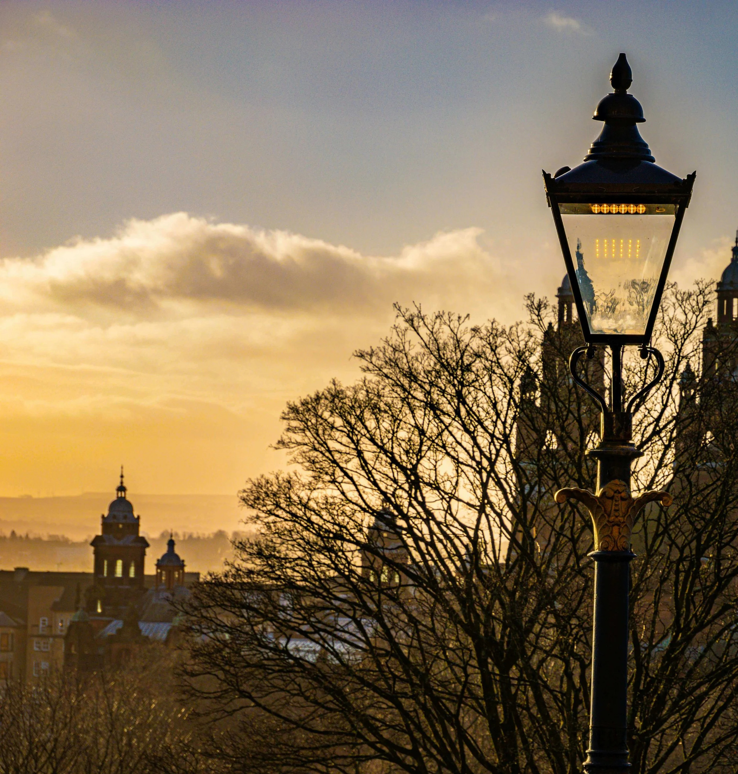
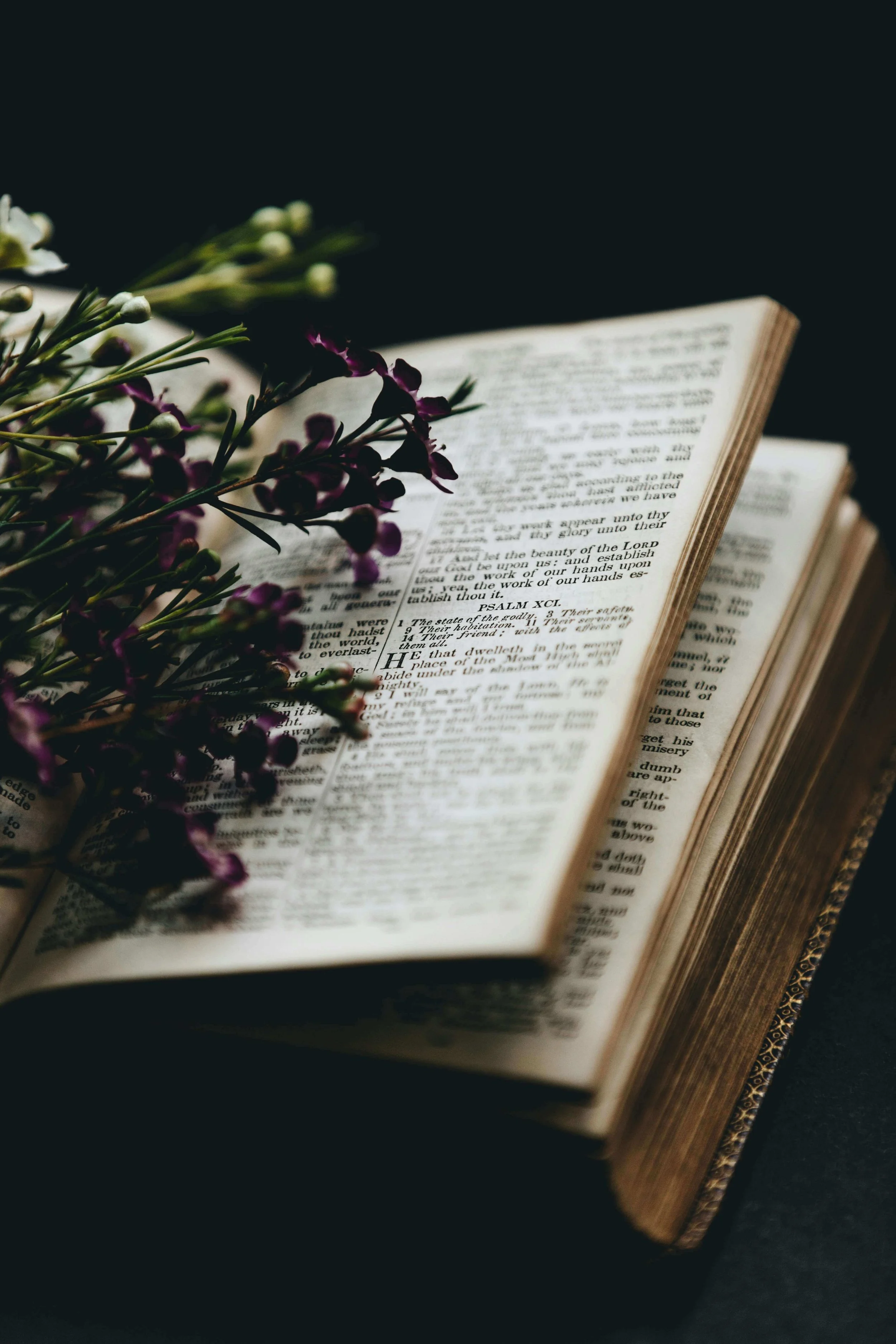
Photography focused on atmosphere over landmarks:
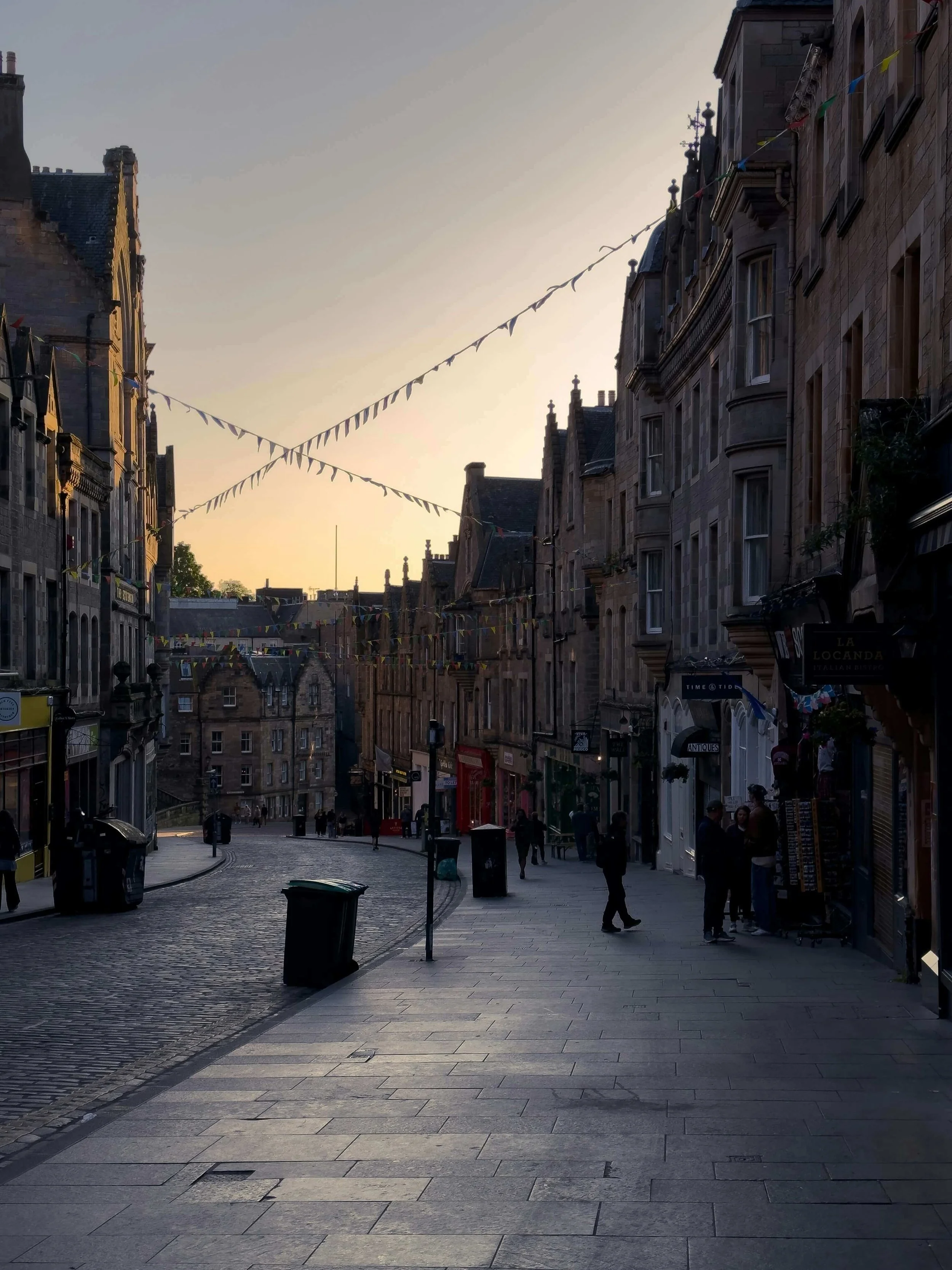
One hero image: A close (narrow passage) at dusk, fog rolling through, golden lamplight barely visible
Not recognizable as "Edinburgh Castle" but unmistakably Gothic Edinburgh
Mood, shadow, texture—feeling not facts
Subtle texture in backgrounds:
Very light stone texture, barely visible
Adds depth without distraction
You feel it more than see it
Layout structure that echoes duality:
Clean, structured sections (New Town's Georgian planning)
Alternating light and dark sections (Old Town/New Town, Jekyll/Hyde)
Breathing room and white space (modern sophistication)
The result:
A website that feels unmistakably Edinburgh Gothic without ever showing you a castle.
Visitors would experience the atmosphere—the duality, the shadow, the sophistication hiding darkness—through pure visual design.
That's place as brand essence, not place as decoration.
The 5 Elements of Place-Based Web Design
Let's break down exactly how to do this for YOUR place and brand.
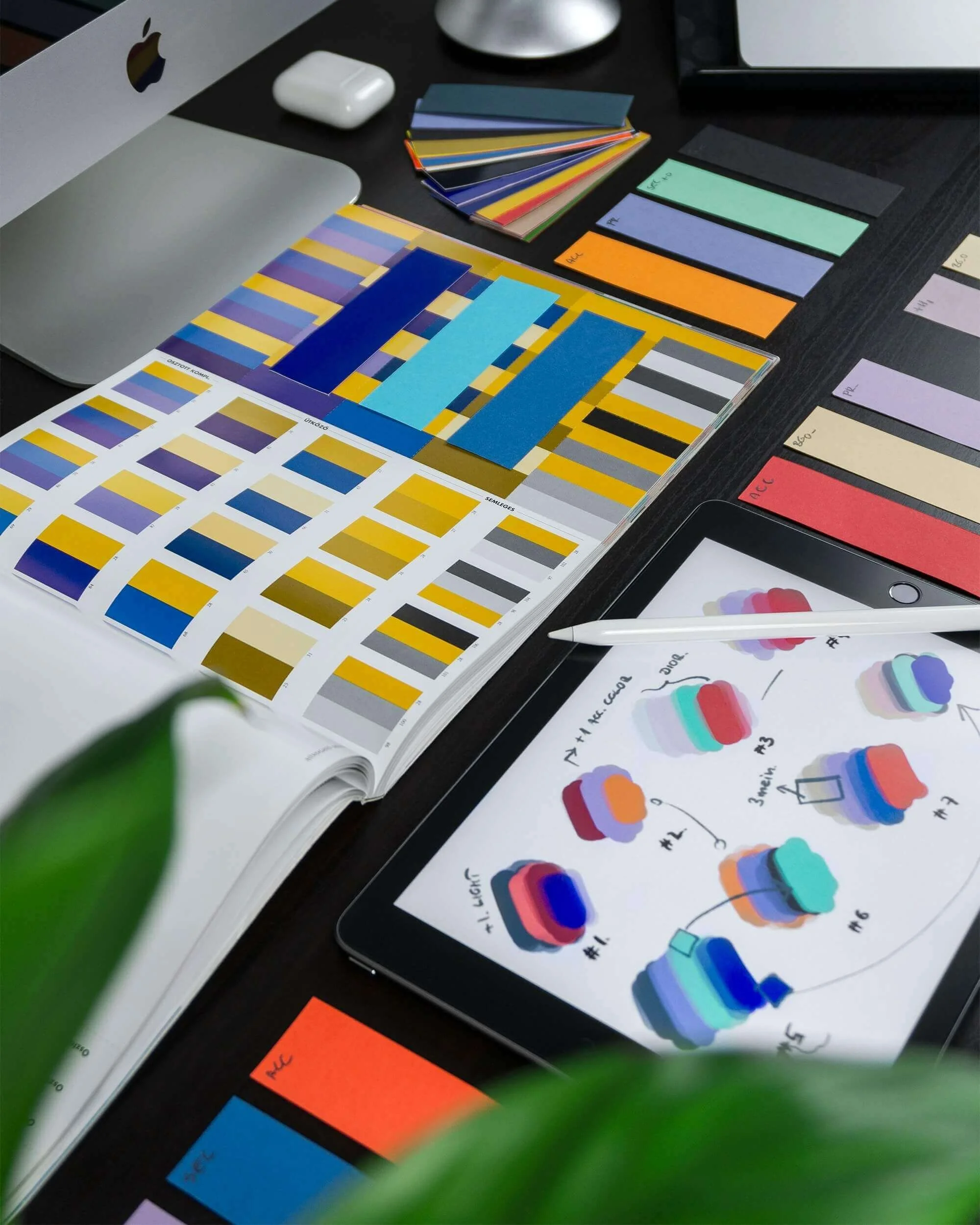
Element 1: Color Palette Derived from Landscape
This is your foundation. Colors should evoke your place without naming it.
How to choose:
Take 3-5 photos of your place that capture its essence.
Not tourist shots—atmospheric ones.
Early morning light, weather patterns, textures, shadows.
Use a color picker tool (built into most design programs, or free online) to pull actual colors from these photos.
Select 4-5 colors total: 2 neutrals, 2-3 accent colors.
Examples:
Pacific Northwest: Deep evergreen, gray mist, salmon pink (subtle, not bright), weathered wood brown
Southwest: Terra cotta, sage green, cream, deep sunset orange (warm but sophisticated)
Coastal New England: Navy, sand, sea glass green, weathered shingle gray
Edinburgh (RLS's brand): Stone gray, heather purple, night black, golden cream
The test:
Show someone your palette.
Without telling them the place, do they feel a sense of location?
Does it evoke atmosphere?
Pro tip: Pull colors from YOUR actual photos of the landscape, not generic "beach palette" inspiration boards from Pinterest. Specificity matters.
Element 2: Typography That Reflects Character
Fonts aren't just about readability. They convey personality and place.
Historical places (Edinburgh, Charleston, Boston):
Serif fonts with weight and gravitas
Nothing too delicate—substantial letterforms
Think: literary tradition, established history

Modern cities (New York, Tokyo, Singapore):
Clean sans-serifs with geometric lines
Sharp, precise, no-nonsense
Think: efficiency, contemporary energy
Rural/Natural settings (Montana, Appalachia, countryside):
Fonts with organic curves or subtle handwritten elements
Nothing too polished—slight imperfection works
Think: authenticity, groundedness
The RLS/Edinburgh example:
Headings: Substantial serif (historical weight, literary gravitas)
Body text: Readable sans-serif (modern accessibility, not stuffy)
Both fonts have personality but prioritize usability.
The balance you're seeking: Historical inspiration, modern readability.
Avoid:
Overly decorative fonts that sacrifice usability.
If people can't easily read your content, then it doesn’t matter how pretty it looks. Your words are what matter most.
Speaking of typography...
This is complex, nuanced work. I created a free, comprehensive guide that breaks down 57 specific typography elements that separate amateur websites from professional ones. If you're serious about getting this right, you need it.

Element 3: Photography and Imagery Strategy
Atmosphere over landmarks. This is key.
What this means in practice:
NOT: Photo of Edinburgh Castle
BUT: Fog rolling through a close, golden lamplight on wet cobblestones, shadows and texture
NOT: Postcard of the Golden Gate Bridge
BUT: Fog obscuring the city, muted colors, that specific San Francisco gray
NOT: Tourist shot of a famous beach
BUT: Storm clouds gathering over water, the particular quality of coastal light

How to capture atmospheric images:
Focus on mood, light, and texture rather than recognizable landmarks.
Abstract details work better than wide establishing shots.
Black-and-white photography sometimes captures atmosphere better than color.
Weather matters enormously—rain, fog, dramatic skies create mood.
Where to use these images strategically:
Header/hero section: One strong atmospheric image, used sparingly
About page: To establish your sense of place
Blog featured images: Occasionally, when relevant
Pro tip: One powerful atmospheric image is infinitely better than five tourist shots.
Element 4: Visual Texture and Pattern
This is advanced but powerful when done right. Subtle background textures that evoke place.
Examples:
Edinburgh: Very light stone texture in a barely visible grid pattern echoing New Town street planning
Beach/coastal: Weathered wood grain texture, subtle organic wave patterns
Forest/natural: Irregular organic patterns, dappled light effects, leaf shadows
The critical word: SUBTLE.
These should be felt more than seen. Someone viewing your site shouldn't consciously notice "oh, there's a texture"—but they should subconsciously feel depth and atmosphere.
Avoid: Overwhelming patterns that make text hard to read or create visual noise.
Element 5: Layout and Structure Philosophy
Here's where it gets sophisticated.
From mythical castles to the streets of Santa Fey, how can the architectural elements of your place inform how you organize information on your website?
Edinburgh example:
Clean, structured sections echoing New Town's Georgian city planning
Contrasting light/dark sections representing Old Town/New Town duality
Narrow content columns (like closes) with generous breathing room around them
Modern city example:
Grid layouts, geometric sections, precise alignment
Clean lines, no ornamental elements
Efficient information architecture
Natural/rural example:
Organic, flowing sections with asymmetrical balance
Less rigid structure, more breathing room
Content that feels unhurried
This is advanced stuff. You don't have to do this. But when done well, it's incredibly powerful.
Practical Implementation: Your Action Plan
Ready to actually DO this? Here's your step-by-step:
Step 1: Define Your Place's Visual DNA

Write down 10 words that describe your place's visual character. Not facts about it—how it FEELS.
Edinburgh example: Gothic, stone, shadow, duality, elegant, dark, literary, historical, moody, sophisticated
Your turn: What 10 words capture the essence of your place?
These words will guide every single design choice you make.
Step 2: Create Your Color Palette
Take 3-5 photos of your place that capture its essence.
Use a color picker tool to pull actual colors from these photos.
Select 4-5 colors: 2 neutrals, 2-3 accent colors.
Test them together: When you see these colors, do you immediately think of your place? Do they evoke the right atmosphere?
Step 3: Choose Typography
Select 2 fonts: one for headings, one for body text.
Both should reflect your place's character (refer back to your 10 words from Step 1).
Test for readability—beauty means nothing if people struggle to read your content.
Step 4: Gather Your Imagery
Take or commission 3-5 atmospheric photos of your place.
Focus on mood: light, weather, texture, shadows, atmospheric details.
Avoid: Obvious landmarks, tourist perspectives, anything that screams "postcard."
These images should make people FEEL the place, not recognize it.
Step 5: Design with Restraint

This is crucial: One or two place-based elements per page maximum.
Your homepage might have: Color palette + one atmospheric photo
Your About page might add: Color palette + subtle texture
The whole site shouldn't scream "PLACE!"—it should whisper it.
The Test:
Show your website to someone unfamiliar with your brand.
Don't tell them about the place connection.
If they say "this feels very [your place]" without any prompting—you've absolutely nailed it.
If they say "I love this design" but don't mention place—that's still success. The atmosphere is working subconsciously.
If they say "Why is there a photo of Edinburgh Castle on every page?"—you've gone too literal. Dial it back.
Bringing It All Together: RLS's Website in Practice
Let's recap how all five elements would work together for Robert Louis Stevenson's author website.
Color palette:
Deep purples and stormy grays pulled from Edinburgh twilight, with warm cream accents for contrast and readability. Each color deliberately chosen to evoke Gothic atmosphere without being literal.
Typography:
Elegant, substantial serif for headings and his name (literary weight, historical gravitas). Clean, modern sans-serif for body content (accessibility, professionalism). Both choices honor the historical while remaining readable.
Photography:
One hero image of Edinburgh's closes at dusk. Atmospheric, moody, fog rolling through narrow passages. You feel the Gothic tradition without seeing a single tourist landmark.
Texture:
Very subtle stone texture in section backgrounds—just enough to add depth and echo Old Town architecture, not enough to distract from his work.
Layout:
Clean, structured sections echoing New Town's Georgian planning, with alternating light and dark sections representing the city's duality (perfectly aligned with Jekyll/Hyde themes).
The result:
Sophisticated. Literary. Gothic-inspired but thoroughly modern.
Visitors would feel Edinburgh in every element—the duality, the shadow, the moral complexity—without ever seeing tartan or a castle photo.
This is place as brand essence working at the highest level.
Your Website as Literary Landscape
We've come full circle.
Robert Louis Stevenson's brand was inseparable from Edinburgh—the city's duality, its dark history, its moral complexity.
If we were designing his website today, it would need to capture Edinburgh's essence visually, not literally.
The same principle applies to YOUR place and brand.
Your author website isn't just where you sell books or list your publication credits.
It's where your brand lives online.
It's often the first impression literary agents, publishers, readers, and media contacts will have of you.
Place-based design—done right—makes you memorable and distinctive in a sea of template websites.
The Robert Louis Stevenson Masterclass: Complete
We've covered a lot of ground together:
Part 1: The 5 foundational lessons from RLS's enduring brand (Coming Soon!)
Part 2: Gothic craft techniques for building atmosphere (Coming Soon!)
Part 3: How place shapes author identity (Coming Soon!)
Part 4: Maintaining brand cohesion across multiple genres (Coming Soon!)
Part 5: Translating it all into practical web design
You now have the complete framework for building an author brand that lasts.
RLS died 130 years ago, yet his brand is so strong that he's still the 26th most-translated author in the world. That's the power of authenticity, craft excellence, thematic consistency, and strategic use of place.
Your brand can have that kind of staying power too.
Start with authenticity. Build with intention. And never underestimate the power of place to differentiate you in a crowded marketplace.
Feeling overwhelmed?
I get it—this is sophisticated, nuanced work. The good news? You don't have to figure it all out alone. This is exactly what I do for authors: translate your unique brand (including place, themes, and voice) into a website that makes you proud. Let me handle the design while you get back to writing.